Sports
Professional Women’s Hockey League Unveils Team Names and Logos

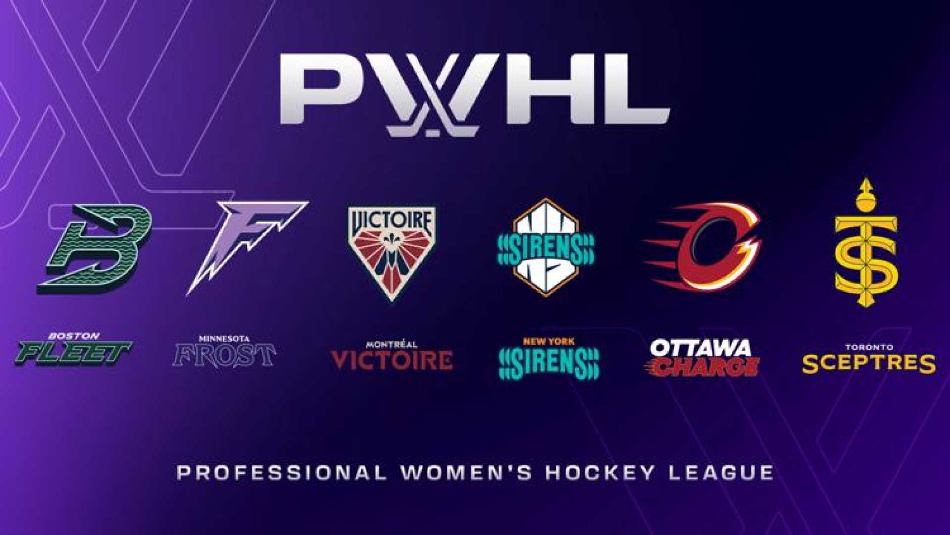
The Professional Women’s Hockey League (PWHL) has officially announced the names and logos of its six franchises, marking a significant milestone in the league’s development.
The teams, which will be active in the upcoming season, are the Boston Fleet, Minnesota Frost, Montréal Victoire, New York Sirens, Ottawa Charge, and Toronto Sceptres. This announcement follows a successful inaugural season where teams played without official names or logos, using only city names on their jerseys.
The Boston Fleet symbolizes the maritime history of Boston, showcasing a logo featuring a green ‘B’ shaped like an anchor. The Minnesota Frost presents a sharp-edged ‘F’ resembling icicles, reflecting the state’s cold winters.
The Montréal Victoire’s crest includes the name ‘Victoire’ above a winged figure, representing the Goddess of Victory, and incorporates the Fleur-de-lis, a symbol significant to Quebec. Captain Marie-Philip Poulin expressed excitement over the new identity, emphasizing its presence in the arena and on merchandise.
The New York Sirens’ name draws inspiration from both the city’s sounds and a hockey goal horn, featuring the word ‘Sirens’ in teal intertwined with large white ‘NY’ letters. Similarly, the Ottawa Charge reflects the city’s motto, with a logo depicting a red ‘O’ that suggests momentum.
The Toronto Sceptres’ name pays homage to the city’s royal history and combines the letters ‘T’ and ‘S’ in gold to form a symbol of a sceptre. Captain Blayre Turnbull noted that having a distinct name is advantageous for both players and fans.
The newly minted identities are expected to enhance fans’ engagement, as the league prepares to unveil new jerseys later this fall. The PWHL aims to retain primary colors from the previous year while introducing secondary colors for each team.
PWHL executives, including vice president of brand and marketing Kanan Bhatt-Shah, led the branding process in collaboration with a creative agency. They sought input from fans and the league community to ensure that the team names resonate with the fanbase.
Despite the enthusiasm surrounding the new logos and names, some fans expressed mixed reactions. Concerns about originality emerged, particularly regarding the Ottawa Charge’s emblem and the Boston Fleet logo’s resemblance to the former NHL team Hartford Whalers.
The new branding reflects a step forward for the league as it continues to carve out its identity in the sports landscape, enhancing visibility and engagement among fans.


