Tech
Google Revamps Iconic ‘G’ Logo for First Time in Nearly a Decade

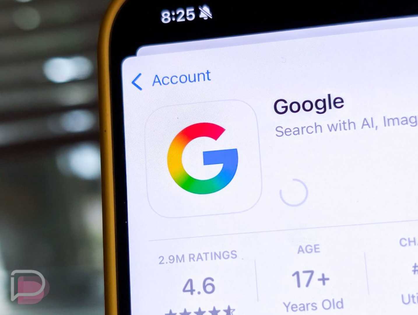
Mountain View, California – Google has unveiled an updated version of its iconic ‘G’ logo, marking the first significant change since 2015. The new design features a vibrant gradient that blends red, yellow, green, and blue instead of the previous solid color sections.
The updated logo began appearing in the Google Search app on iOS on May 12, 2025, and was subsequently rolled out to Android devices with the beta version of the Google app (version 16.18). This change aligns with the design aesthetic of Google’s new Gemini product line.
Google first introduced the current circular design of the ‘G’ logo on September 1, 2015, as part of a broader branding update that included a shift to a modern sans-serif typeface, Product Sans. Prior to this, the company used a lowercase white ‘g’ on a blue background.
With this latest update, the four colors now flow into one another seamlessly. ”It looks more vibrant and colorful,” said a Google representative. ”The new design maintains our commitment to a fresh, modern aesthetic while enhancing brand recognition across our products.”
Despite the change, users may not notice the update immediately, particularly if the main usage is on home screens or as small browser favicons. As of now, the traditional logo still appears on the web and other Android devices.
The decision regarding whether other product logos, such as Chrome or Maps, will adopt the new gradient style remains unconfirmed. Google has not announced any immediate plans to refresh its main ‘Google’ wordmark.
As Google’s updates continue to roll out, more users are expected to experience the redesigned logo across various platforms, hinting at potential further changes in the near future.


